When expanding into China, simply translating your app’s interface isn’t enough. Local users expect intuitive design, culturally relevant language, and seamless function. This guide breaks down how to truly localize your UI/UX for the Chinese market.
Focus on simplicity, cultural fit, native phrasing, and mobile-first design to ensure smooth user experience and engagement in China.
Read on to uncover best practices backed by user behavior, regional preferences, and successful case studies that will help your product gain traction in one of the world’s biggest markets.
📱UI/UX Localization in China: Key Differences
Chinese users interact differently with apps due to language structure, cultural context, and mobile habits. As a general rule, apps should prioritize clarity, speed, and hierarchy.
Language nuance matters: literal translation doesn’t work. For example, “Save” is better as “保存” instead of “储存”.
Visual layout: Chinese characters take less space, so interfaces often look denser but need to avoid clutter.
Quotes: “Clarity and responsiveness win in China. Users don’t tolerate confusion,” says Zhang Lei, UX director at Tencent.
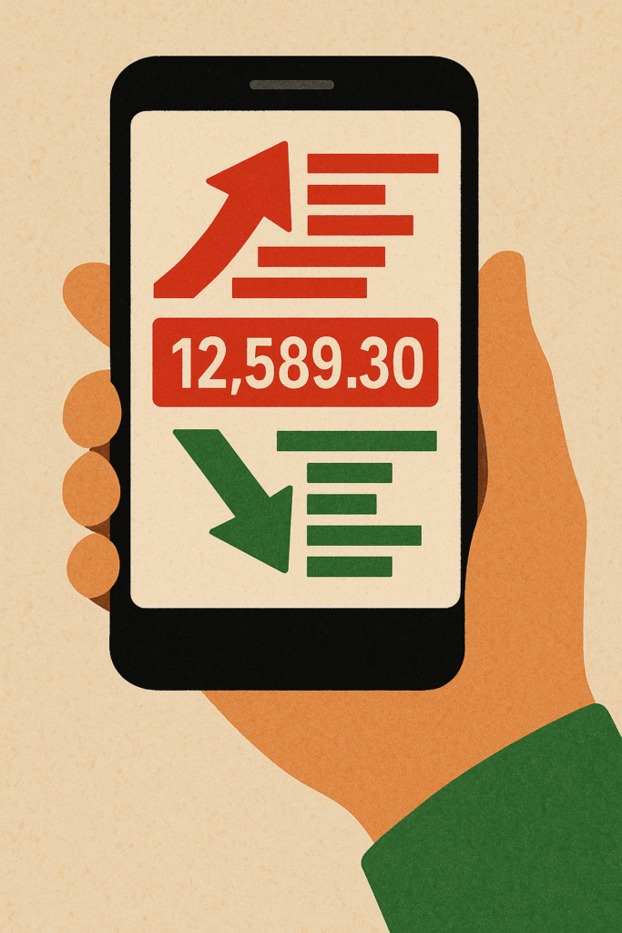
Cultural context: Red means success/luck; green can signal risk in finance apps.
In total, 80% of popular Chinese apps follow a “functional first, then beauty” model.
When compared to Western apps, Chinese interfaces may seem crowded. But this reflects a preference for visibility and accessibility over white space.
Chinese users are also highly goal-oriented. On average, they expect to complete tasks with minimal clicks and maximum guidance. Features like floating action buttons, quick-entry menus, and fixed-position toolbars are widely appreciated.
📊 What UI Text Should Be Localized?
Buttons, menus, error messages, and notifications—everything users read—must feel natural. As a whole, using native expressions over direct translation improves user trust.
- Example: “Account” → “账户” is better understood than “账号”.
- Avoid jargon unless it’s industry-standard in China.
- On average, localizing UI text improves conversion rates by 17-25% (Source: AppAnnie, 2023).
Moreover, avoid cultural missteps. For instance, number “4” (associated with death) might be better omitted in steps or lists. Consider replacing with other labels (A, B, C or emojis).

Politeness also plays a role. Buttons that say “Try for Free” often perform better as “免费体验” (Free Trial), emphasizing the offer without sounding pushy.
🌐 How Does Culture Affect UX Expectations?
Cultural preferences drive UX in subtle ways. Users value efficiency, clarity, and minimal typing. QR codes are everywhere, and WeChat-style navigation is expected.
| UX Factor | Cultural Insight / Design Implication |
|---|
| Efficiency & Clarity | Users prefer fast interactions, minimal typing, and straightforward layouts. |
| QR Code Usage | Ubiquitous in Chinese digital life—used for logins, payments, and sharing. |
| Navigation Style | 74% of Chinese users prefer Chinese-style navigation (e.g., WeChat-style bottom tabs, visible options). |
| Trust-Building | Use seals, ratings, or real-name verification to establish credibility. |
| Menu Design | Explicit menus work best. Avoid hiding features behind icons or gestures. |
| Onboarding / First-Time Use | Provide tooltips or brief walkthroughs to guide new users. |
| Social Engagement | Integrate sharing options for WeChat Moments or groups. Users actively engage with social features. |
| Gamification | Use daily rewards, badges, and point systems to boost retention and encourage engagement. |
Chinese users tend to engage with social features more actively. As a general rule, apps should offer sharing options to WeChat Moments or groups. Additionally, gamification elements—like daily rewards, badges, or point systems—boost retention.
📲 What Are Mobile Priorities in China?
China is a mobile-first country. As a general rule, apps must load fast and support various devices.
Prioritize vertical layouts and thumb-friendly navigation.
Integrate local features like WeChat login or Alipay paywalls.
As a whole, Chinese users are less forgiving of slow load times—3 seconds max is critical.
Testing on Android should be prioritized due to device diversity. While iPhones are popular in urban centers, the majority of users rely on mid-range Android devices.
Use lightweight design elements. In total, China’s mobile networks still have gaps in speed and coverage in rural areas. Apps that function well on 4G or spotty WiFi are favored.
Don’t forget mini programs (within WeChat or Alipay) which are widely used for e-commerce, education, and utility tools. These need even tighter UI/UX logic due to screen size and performance constraints.
📦 What Else Should You Localize Beyond Text?
Localization is more than just translation. A fully localized app takes into account:
| Localization Element | Preferred Chinese Format | Notes / Comparison |
|---|
| Date / Time Format | 年-月-日 (e.g., 2025年03月31日) | Year → Month → Day. Time typically 24-hour. |
| Currency Format | ¥ (e.g., ¥88.00) | Use Chinese Yuan symbol instead of $. |
| Address Format | Country → Province → City → District → Street (e.g., 中国北京市朝阳区建国路) | Reverse of Western format (general → specific). |
Payment flows are also essential. Chinese users expect Alipay, WeChat Pay, and sometimes UnionPay. In total, over 90% of mobile payments in China are made via these platforms.
Customer support options like Mandarin chatbots, local FAQ pages, or live chat during Beijing work hours enhance the UX significantly.
Also consider seasonal changes. Chinese New Year, 618 Shopping Festival, and Singles’ Day (11.11) are peak engagement times. Adapt UI themes and promotions accordingly.
As a whole, UI/UX localization should aim to make the user feel “this app is made for me.”
By following these practices, your app will not only be functional in China—it will feel familiar, trustworthy, and engaging. That’s the real goal of localization: to blend so seamlessly into the user’s world that nothing feels foreign.
Need help localizing your app? I can help you review your UI/UX step by step for the Chinese market.
